Once you have begun collecting environmental data you are ready to set a timeline for environmental data analysis. Having a full year of data is ideal for preservation planning, but analysis can begin at any time – particularly if you are troubleshooting after a water incident or an equipment malfunction.
Analysis doesn’t need to be complicated: if you’re looking at your data and drawing conclusions from what you see, you’re doing analysis.
Graphs make environmental data analysis easier
Data can be presented in different ways: the two most common are the table and graph formats. Tables will have at least three columns for every sensor, one showing the time of the reading, another for the temperature, and a third for the relative humidity.
You can definitely scan these tables for high and low readings, but the information is easier to digest and to share in the more visual format of a graph.
If you are handy with Excel, you can convert to a graph yourself but the software program that comes with your sensor will do this conversion for you — and also usually generate things like the average reading over time.
Choose what you want to see on your graph
Once you have your data in a graph format, select the period of time you want to look at and pick the sensor or sensors you want to read. Do you want to see all the data since you began collection? Or just the last month? Do you want to compare sensors, or just look at one in a troubled area?
If you are just starting out, pick one sensor and restrict the time period to one week.
Here is a screenshot from the Conserv software that illustrates what you might see:

- Conserv software graph of temperature over time. The horizontal X axis represents reading time and the vertical Y axis marks the temperature in degrees Fahrenheit. The solid blue line shows interior temperatures measured by the sensor and the dotted line shows exterior weather data for comparison.
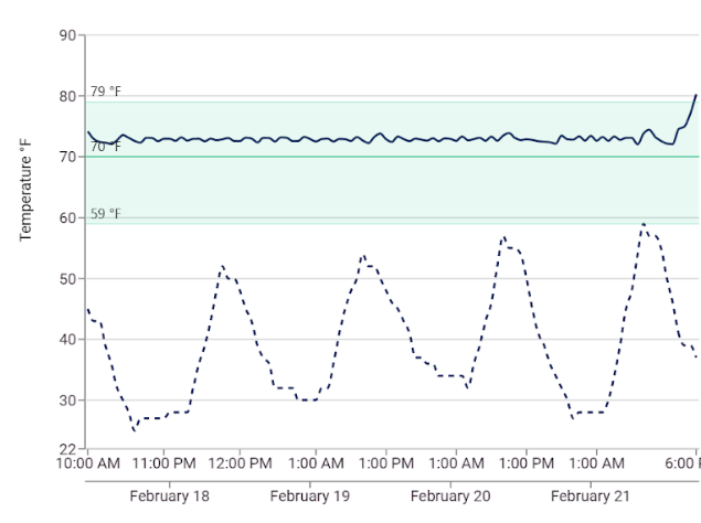
This shows the temperature, indicated by the solid blue line, for a single sensor from February 17th to the 22nd. The green band indicates the international temperature range guidelines for collections (59ᵒF – 77ᵒF) and the dotted line represents exterior weather data. The solid blue line is made up of the data points collected by the sensor every hour.
If we want to look at more data, we can ask to see readings taken every 15 minutes, and if we want less we can ask for daily readings. This is called the aggregation rate.
I recommend playing around to see what sorts of graphs are generated from different aggregation rates, but I usually settle on the hourly readings.
Analyzing your environmental data graph
Environmental data analysis involves looking for patterns, relationships and unexpected occurrences in your dataset. The temperature we see in this graph is fairly constant, with fluctuations of about 1 degree occurring roughly once an hour and the levels staying within the green band. There are a few things to note here: first,
because of the regularity, we can be fairly certain that the fluctuations are caused by the HVAC system cycling on and off to maintain the temperature.
Second, comparison with the exterior weather data shows that outside there is a fairly dramatic change between daytime and nighttime temperatures. But this isn’t reflected in our sensor’s readings. That’s good; it shows us that the building envelope is doing an excellent job of maintaining a stable environment inside. The last thing we see here is a spike in temperature at the end of the data reporting period. What is causing this?
Could it be an HVAC malfunction? Was the sensor moved?
We can’t tell from the data, but because the temperature is heading outside of the green zone it’s an incident that might warrant further investigation.
Comparing temperature and relative humidity can tell us more
Now let’s compare temperature and relative humidity to one another. We’ll stay with just one sensor.

- Conserv software graph of temperature and relative humidity (RH) over time. The horizontal X axis represents reading time. The vertical Y axis at left marks the temperature in degrees Fahrenheit and vertical Y axis at right shows percentage RH.
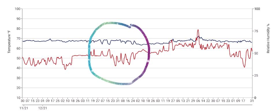
In this graph the temperature is represented by the blue line and the relative humidity by the red line. (We can no longer see the exterior weather data or green bands showing the recommended guidelines, but that information exists for us in other places if we need to reference it.) There is a lot going on with the relative humidity in this space but let’s focus in on the area within the circle.
This shows a very common feature of the interdependence of temperature and RH: mirroring. Within a closed system, when the temperature goes down, the RH goes up and vice versa.
We often see mirroring in airtight spaces that don’t have separate humidification or dehumidification built into the HVAC system. In this type of system, relative humidity can be stabilized to a certain degree by maintaining a stable temperature.
But what about the other areas of the graph, where the RH fluctuations don’t mirror the temperatures? While the data don’t tell us exactly what is going on,
we can see that the RH levels are varying from a high of over 75% to a low of around 30% – greater than the recommended 45%-55% range.
Setpoints may need to be established or adjusted, or upgrades may need to be made to the HVAC system to be able to better control the environment.
A year’s worth of data completes the picture
Finally, let’s look at what a full year of data can tell us. Below you will see two different graphs from the same sensor; the top graph shows the temperature data together with exterior weather data (the dotted line). The bottom graph shows relative humidity.

- Conserv software graph of temperature over one year. The horizontal X axis represents reading time and the vertical Y axis marks the temperature in degrees Fahrenheit. The solid blue line shows interior temperatures measured by the sensor and the dotted line shows exterior weather data for comparison. The bar graph at the bottom illustrates temperature fluctuations per 24 hours.
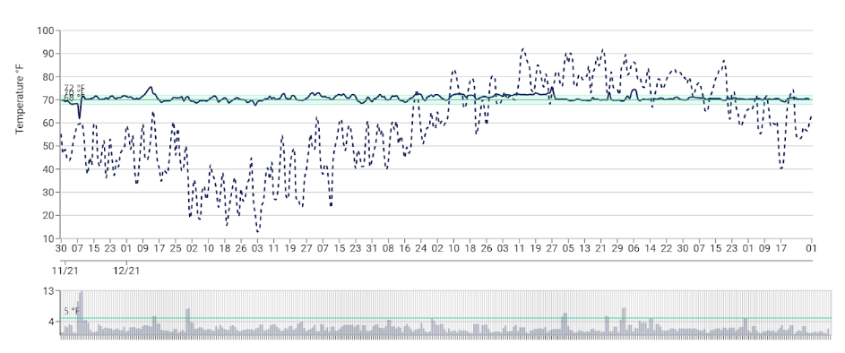
The temperature here shows some room for improvement, with highs and lows that cross outside the green band of target temperatures. These make me want to zero in on those specific dates to see what was happening elsewhere in the building, or with the HVAC system, that might have contributed to the extremes. But, overall, the building is holding steady against a seasonal pattern of cold temperatures in the winter and hot temps in the summer.

- Conserv software graph of relative humidity (RH) over one year. The horizontal X axis represents reading time and the vertical Y axis marks the percentage RH. The bar graph at the bottom illustrates RH fluctuations per 24 hours.
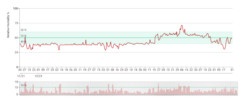
The relative humidity for the same space is much more variable and illustrates a pattern that is very common:
low RH levels in the winter months when the heating systems are on, and high RH levels in the summer when the air conditioning cools the air but doesn’t remove the moisture.
This is very typical of an HVAC system without the capacity to humidify or dehumidify.
The two graphs above have an additional feature: the 24-hour fluctuation bar graph at the bottom of the images. This is a powerful tool for illustrating the stability of your environmental system, and I’ll talk more about it in the next section on Reporting.

Get to know your space through environmental data analysis
These screenshot images have illustrated a few of the features and more common issues that you can expect to see when you begin to analyze the temperature and relative humidity data from your sensors. As you collect data over time you will begin to recognize patterns and ultimately even predict the changes that occur in your collection spaces.
Hear more from Nicole Grabow, Director of Preventive Conservation at The Midwest Art Conservation Center, in the Conserv Community.
If you have any questions about environmental monitoring, integrated pest management, or just want to talk about preventative conservation, please reach out to us! Don’t forget to check out our blog or join our community of collections care professionals where you can discuss hot topics, connect with other conservators or even take a course to get familiar with the Conserv