A data report is any type of documentation that describes an analysis of your environmental data. It can be short and simple or quite complex, depending on the amount of data and the depth of your analysis of your collection’s environment.
Reports are used to share information with partners who may not have access to the data, or who don’t have the time or expertise to analyze it directly.
These may include your organization’s director or Board, the facilities manager, potential lenders, or even grant reviewers. For example, sharing a data report as part of a grant application can back up a claim that you need to upgrade your HVAC system. And, once completed, environmental data reports can show your Board what an improvement such an upgrade has made.
Start with the essentials in your environmental data reports
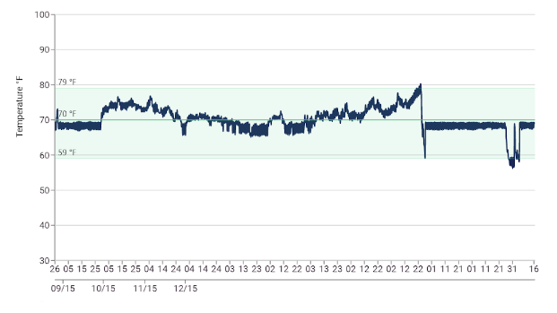
I start with simple reporting that includes just three things: highest, lowest, and average readings for a given space over a period of time. Notice that I said three things, but I actually listed five: the space and the period of time are essential details to include in every report. Let’s look at temperature data from a single sensor:

- Conserv software graph of temperature over time. The horizontal X axis represents reading time and the vertical Y axis marks the temperature in degrees Fahrenheit.
A simple environmental data report generated from this sensor data would include something like this:
- Sensor 8 Temporary Exhibitions Gallery
- August 17, 2015 – August 16, 2015
- High Temperature: 84ᵒF
- Low Temperature: 51ᵒF
- Average Temperature: 70ᵒF
To find these numbers, you can analyze your data by hand or use features embedded in your sensors’ software. (The Conserv software Create report tool will generate highs, lows, and averages for you.)
Summarize and interpret
Adding a summary of what this means for your collections and system performance will help your partners to understand the data. For example, the green band in the graph above indicates the internationally recognized guidelines for temperature in mixed collection spaces, 59 – 77ᵒF. Our summary should point out that the high and low temperatures went beyond that range and could even make recommendations for improvement, such as adjusting set points or adding notifications.
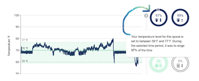
Conserv software provides a feature that tells you how much time was spent within the green bands, which is very useful in a report evaluating HVAC performance.

- Conserv software graph of temperature over time with a key performance indicator (KPI) showing you what percentage of time the temperature was within your target range.
Reporting increases in complexity when additional readings, such as relative humidity, or additional sensors are included. Keep temperature and relative humidity separate but consider grouping sensor data within a space – or even throughout your facility – to provide a general overview.

Keep an eye on fluctuations
For a collections care environment two things are important: keeping temperature and relative humidity within recognized guidelines and also avoiding fluctuations within a 24-hour period. The ASHRAE Handbook recommends avoiding 24-hour fluctuations greater than 4ᵒF for temperature and 10% for relative humidity. You can find and note these jumps by combing through your data by eye, or by using tools embedded in some software programs. You may recognize the relative humidity graph below from the blog entry on environmental data analysis for collections:

- Conserv software graph of relative humidity (RH) over one year. The horizontal X axis represents reading time and the vertical Y axis marks the percentage RH. The bar graph at the bottom illustrates RH fluctuations per 24 hours.
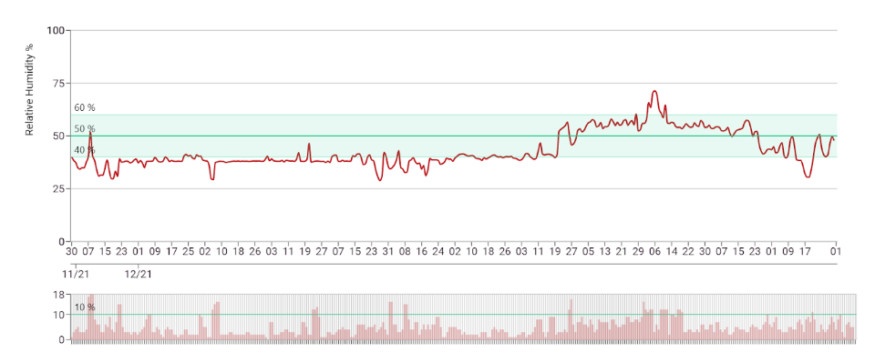
Note the grey bar chart below the main graph. This indicates relative humidity fluctuations within a 24-hour period and includes a green line at the 10% mark – making it easy to identify instances when the fluctuations were greater than recommended.
Reporting that includes not only highs and lows outside the recommended range but also any fluctuations that exceed safe levels will provide a straightforward and comprehensive picture of your collection environment.
Comparisons and complex reporting
Use your data analysis to note comparisons between sensors and spaces, and include these in more complex, comprehensive reports.
For example, a report that presents data from 10 different sensors might note that the average temperature from sensors located in galleries facing west was higher than those in galleries facing north.
The relationship between temperature and relative humidity can play out in a variety of ways depending on the tightness of your building envelope, local environmental conditions, and the capacity of your heating and cooling systems. Complex reports will assess this relationship, draw conclusions, and call out trouble spots.
Collaborate on a timeline
Sharing data reports with your partners provides them with concrete evidence of environmental conditions, but doesn’t overwhelm them with all the data, and allows you to collaborate to solve problems and make improvements.
Begin with quarterly data reporting and meet with facilities to go over areas of concern.
In a larger building with multiple air handling units, facilities staff will be able to tell you which units operate in which areas. By working together you can identify equipment inefficiencies and tweak set points to respond to the needs of specific spaces, such as a temporary exhibition gallery with loan requirements for a traveling show.
After one complete year of data collecting, develop a more detailed report that points out seasonal trends and helps to anticipate upcoming periods of stress to your systems (spoiler alert, they will likely be in the shoulder seasons of spring and fall).
Share this annual report with leadership and/or present the information at a meeting of the Board to communicate when there is a need for a change, when systems are performing well, and the importance of environmental monitoring for collections preservation.
“Before and after” environmental data reports
After upgrades or changes, watch readings closely and generate a report that illustrates the differences before and after. If you adjusted set points in anticipation of a gallery installation, confirm that levels have reached their target and stabilized before you install the artwork. If you received a grant to upgrade your HVAC system, a data report covering the period of change should be included in your final grant report.
Environmental data reports lead to action
Reporting provides a record of your data analysis and makes sharing and collaborating possible. Reports can be very simple, but they should do more than just copy the data, they should provide insights and make recommendations – if needed – for changes that will help to improve environmental conditions for your collections.
Hear more from Nicole Grabow, Director of Preventive Conservation at The Midwest Art Conservation Center, in the Conserv Community.
If you have any questions about environmental monitoring, integrated pest management, or just want to talk about preventative conservation, please reach out to us! Don’t forget to check out our blog or join our community of collections care professionals where you can discuss hot topics, connect with other conservators or even take a course to get familiar with the Conserv platform.